If you’ve been in business for longer than a couple of years and your brand is active in the digital space, you’ve hopefully redesigned your website at least once. And if you haven’t, you should look into it (maybe by contacting us right now - seriously, it’s that dire).
Your site isn’t something you can create and then forget about; it should change, grow and adapt the same way your business does. With digital technology and graphic design trends evolving so often, your site needs to stay fresh in order to remain relevant - because that’s what consumers are expecting.
Website redesigns are simply a part of doing business in 2016. However, site redesigns are like sites themselves: they can be good, bad or ugly. And unfortunately for a fairly big brand (at least in Canada!) that recently redesigned their site, it was more ugly than anything else.
As a hockey fan, I can say with confidence the NHL definitely needed to redesign their website. The old site was stale, cluttered and obviously not created with the mobile experience in mind. If the NHL had such good reasons to redesign their site, why did it go so wrong?
Before I dive into the NHL’s website redesign issues, let me clarify that my views are the insights of an outsider. I, of course, wasn’t involved in the design process, so I can’t be sure why the NHL made the choices they did, nor am I 100% certain of the reasons the end result is not, in my opinion, very good. The overall goal of pointing out NHL.com’s flaws is to help you guys avoid making the same mistakes they did when you inevitably redesign your site.
Here’s why I think the NHL’s redesign hasn’t quite worked:
They Worried Too Much About the Design
Wait, what...how can that be? How can brands care too much about design? I hear you screaming (in Vince Vaughn’s voice) right now: erroneous!
Hear me out.
Design is important. Really important. But during a redesign, if you focus 100% of your efforts on the aesthetics of your site, you’re making a big mistake.
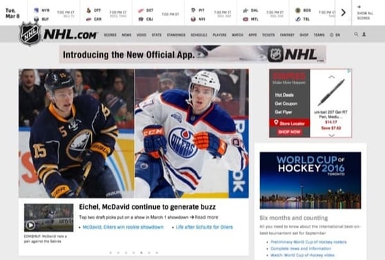
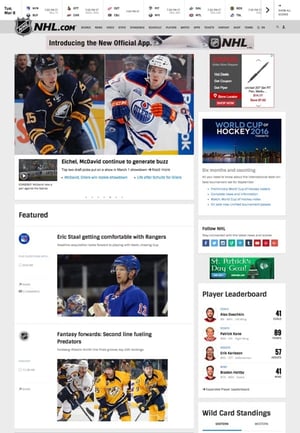
The look and feel of the new NHL.com is good. They’ve played it simple with a white, black and grayscale color scheme, and used clean lines and large images. The mobile and tablet versions of the site are better and it’s now responsive; again, these are wins for the redesign.
However, a redesign must be more than everybody saying, “Okay, the new site looks better than the old site, our work here is done!”
The problem with the new NHL.com is once you start actually using it, the clean and fresh aesthetic immediately becomes less appealing. A lot less appealing.
There’s always going to be some level of frustration from users when you introduce change, but the backlash against the NHL’s new site has been widespread and unanimous. Regardless of whether they like how it looks - some do and some don’t - people are universally claiming that it’s harder to actually use than its predecessor.
Among the things about the new site that users are complaining about: difficult navigation, the removal of game highlight video recaps and the fact that information is harder to find and presented in a less digestible manner.
The takeaway here is that when you’re redesigning a site, you can’t sacrifice the good things about the old site in order to meet a new agenda. Yes, the NHL needed to create a mobile-friendly experience, but they didn’t need to package it in a design that abandons everything about their site’s functionality that worked. Design and functionality go hand-in-hand, especially during a website redesign.
They Rushed It
It seems a little bit like the NHL suddenly thought, “Crap, our site isn’t responsive and delivers a poor mobile experience - we need to fix it as quickly as possible.” Well, yes and no; they did need to fix their mobile experience issues, but not at the expense of discovering the other requirements of a redesign. And certainly not by rushing the project along as quickly as possible.
Before you do any sort of redesign, you need to understand the goal of the project which, if you’re doing things correctly, is based on your audience’s wants and needs. Chief among NHL fans’ needs: having a website they enjoy using while the NHL season is ongoing.
More than any other area, dropping a huge website overhaul near the end of the season - in the middle of the race for the playoffs - is where the NHL made its biggest mistake. Because really, most of the things they’ve done make sense - there’s just too many issues with them.
For example, the NHL’s website also serves as the home of its revamped streaming service, NHL.TV. This service still called GameCentre in Canada, also definitely needed the upgrade. But upon the launch of the updated streaming service, there were issues right away.
There’s also a ton of tweets like this one:
Do I need a touch screen to start streaming games directly from @NHL.com or am I clicking in all the wrong places? pic.twitter.com/tXbUDVO9eQ
— Aileen Chen (@aileenchen) February 25, 2016
On one hand, it’s natural for users to take a little while to get used to the ins and outs of a new site. But making something more complex while you’re actually attempting to simplify it means you’ve either a) done it wrong or b) in the case of the NHL, rushed your project.
Here’s more proof that the NHL rushed the launch of its new site: pages from the old site still displays, and can be navigated to from the new site.
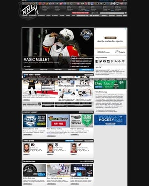
For a huge international brand like the NHL, it’s unprofessional for this to be happening because it underscores that they rushed the project which, in turn, tells the fans that they don’t really care if there are issues. The NHL probably didn’t test anything other than the basics, and it seems extremely unlikely they migrated their site properly (which means more issues down the road). Low traffic niche sites could probably get away with this, but it seems inexcusable for one of the big four North American professional sports leagues.
In the end, I think the NHL is on a path to have a new and improved site, but for the time being, they’ve taken a step backwards by letting one major pain point dictate the process and rushing the project along too quickly.
Eventually, you will have to redesign your website. And when you do, ensure you give it the same care, attention and detail you did when you initially launched your site. Because at the end of the day, every time you redesign your site, you’re creating a new experience for your users - and you better make sure they enjoy it.